


Explore the creative process of professional photographers and filmmakers.
From sketch to final shot:
discover the composing projects by David Lineton.
HYDRATION
MOISTURE
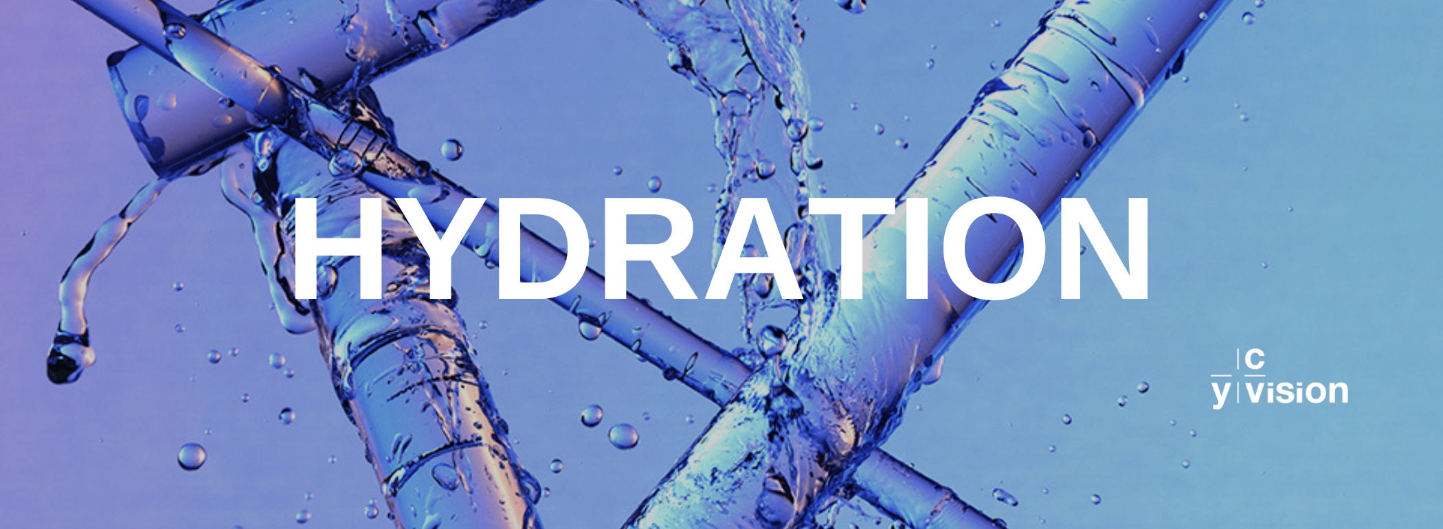
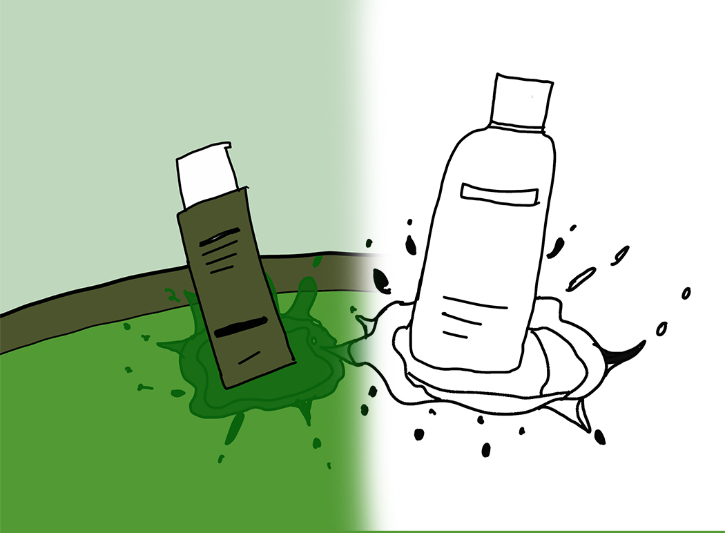
PROJECT 1 | HYDRATION
CONCEPT
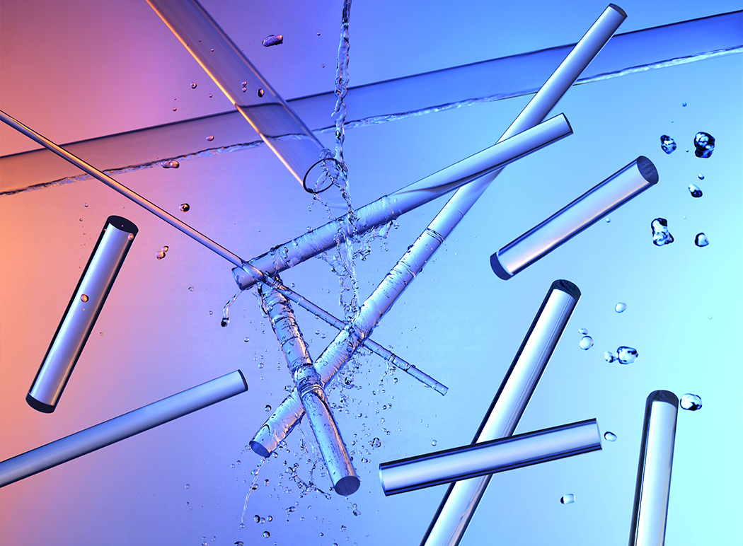
This project was all about creating a visual representation of hydration. The idea stems from visualising how water falls within a scene. Sensorial exploration of what quenching your thirst could look like. The tubes correlating to human anatomy, how water hydrates and moves, constitutes the body.
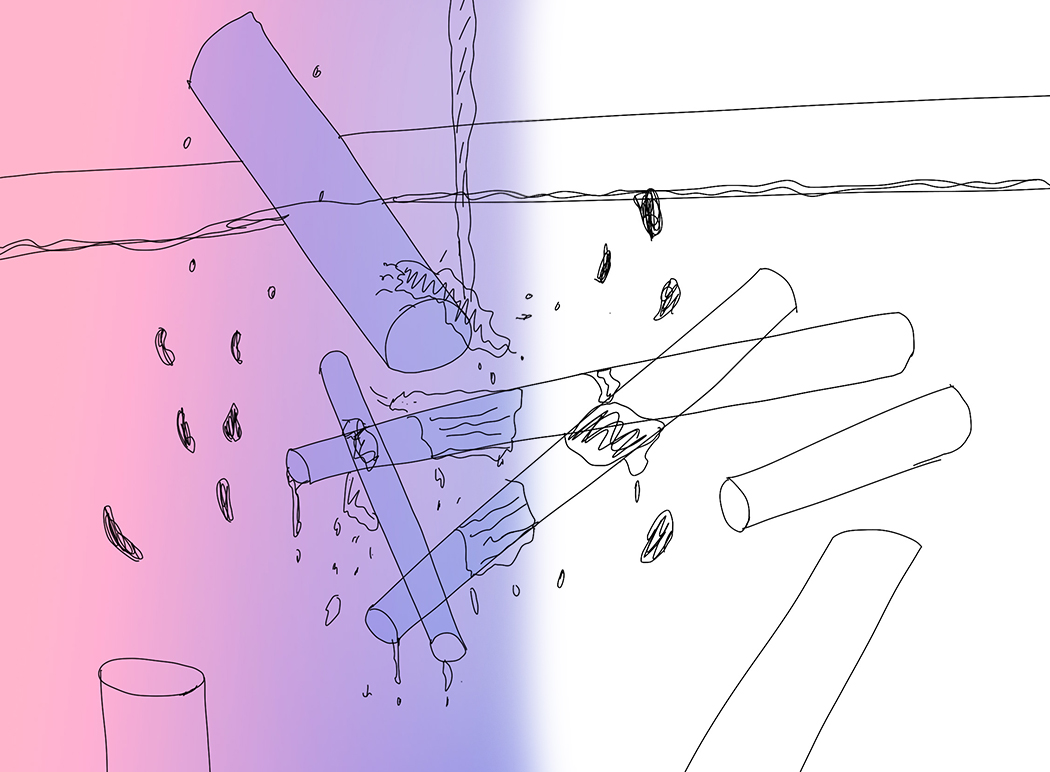
COMPOSITION
It's important to visualize an image before it has formed. The sketches allow me to plan everything from lighting setups to how to angle a frame. In this case, I wanted to create a dynamic scene that allowed me to capture all the subtext and essence of the water concept mentioned above. Every image comes with its own plan.
For this project, instinctually I decided to back-light the image, which heightens its cinematic nature and strengthens the contrast within the photograph. A process of sculpting.
Secondly, using flash here allows me to freeze a decisive moment in time but also, very importantly, it allows me to capture it and texture of water. It also plays a key role in creating synchronicity when shooting multiple images of the same nature, essential when exploring stop frame animation.
SETUP & SHOOTING
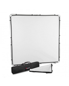
The value of a
cannot be ignored. Often pivotal, it softens off the highlights and creates smooth gradients.
Here it ultimately is allowing me to control light using modifiers, allowing me to explore different elements elsewhere.
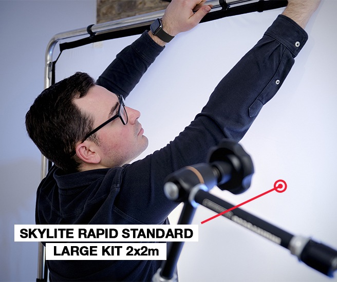
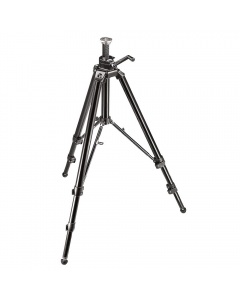
I often consider myself a problem solver and these solutions frequently come down to grips, clamps and my equipment as a whole. Getting the right angles here shows how rare it is that I don’t reach into my toolkit for the super-clamp or the magic arm. To think of those days when a fishing wire was the only way… Now I can explore otherwise difficult if not impossible rigging ideas.
allows me, once again, to explore those dynamic positions which challenge a more conventional setup. Choosing this piece of equipment specifically allowed me be at ease knowing I rely on the sturdiness of the setup.
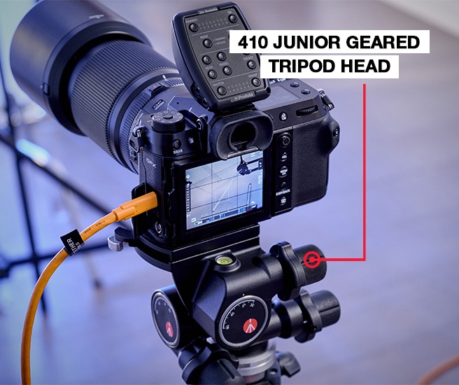
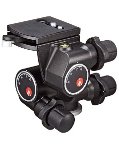
I specifically used a
because it allows me to make micro adjustments that allow me to get the verticals and horizontals lined up. All these decisions is key to working up a concept and achieving a perfect harmonised and balanced final image. This is the equipment that allows me to fulfil my potential as a creative.
FINAL RESULT
I do love creating images with a magical element to them. Getting people asking themselves: “How did they do that?” Well, often this includes brilliant equipment creeping into the frame. In this set-up, it is an arm suspending our subject. In a way, the magic happens thanks to these tools, but post-production is that final cherry on top that finalises the image.
Reliable tools mean reliable ideas. It is thanks to the rigging explored earlier for this image, that we delved into the wonderful world of making gifs, using plate variations that we shot throughout the day. Post finally allowed me to blend them to create this animation. And that’s the nature of the content we create now, elevated and multifaceted, to excel in the fast-paced world we live in.
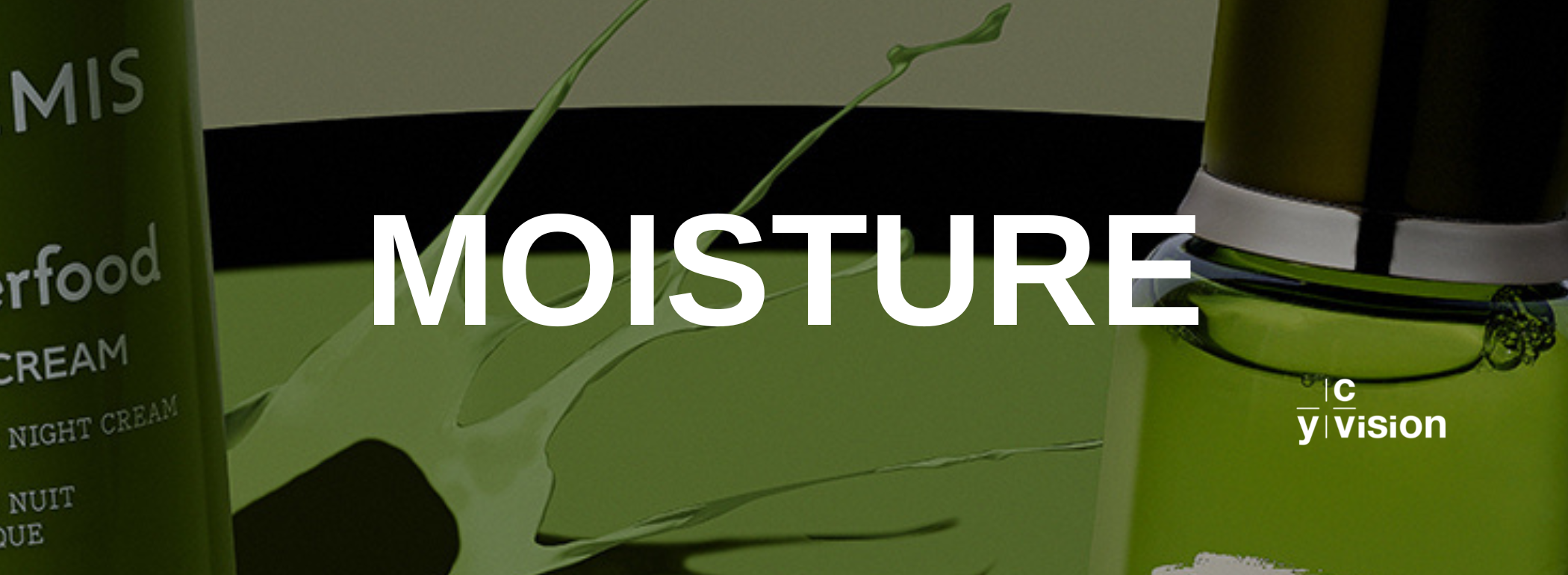
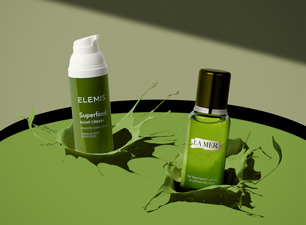
PROJECT 2 | MOISTURE
CONCEPT
Working on the concept for this image, was all about visualising the essence of moisture. I seek out metaphors in my images to be able to fully flesh out the vision I have for the product inquestion. In the world of cosmetics, it’s all about the set enhancing how the viewer experiences the product and consequently the brand. The tactile nature of skincare is approached from a showcase perspective, fit for editorial use.
COMPOSITION
High-speed elements are used here – different projectiles for different splashes. I used spherical and cylindrical objects for splashes. Oblong and square items for splatters. This creates different levels of movement. I chose a single hard-light source, especially to enhance the dynamic shadows. As a commercial still life photographer the subject is most often a product. Here, the selection all stemmed from the colour green. I find it’s a wonderful colour to work with as it shows beautiful spectrums of warmth, but also cooler, richer tones too. It’s a very luxurious colour.
The products themselves are chosen due to their different applications and shapes. I like using tube shapes because they bring different heights to the image which allows me to capture better compositions. By using skylines, the viewer can have different layers to explore.
SETUP & SHOOTING
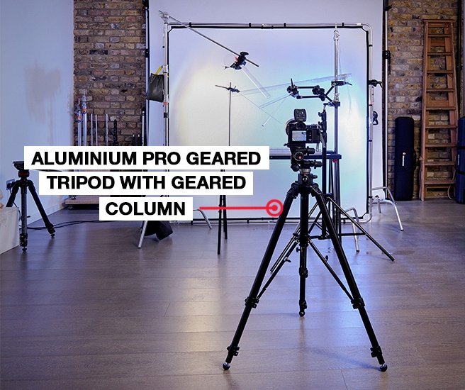
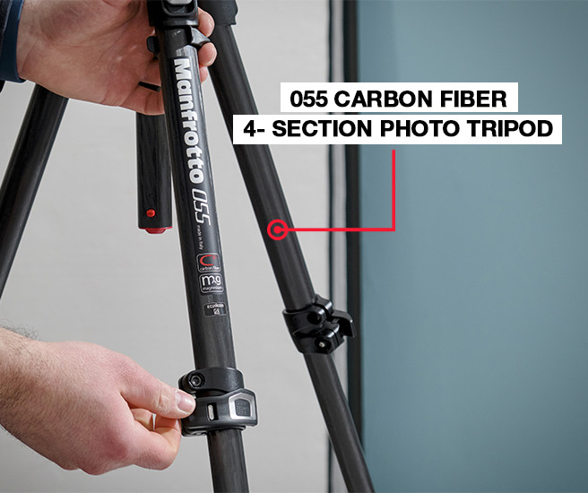
I used my trusted rig set up especially adapted to working with paint. The key here are the brilliant use of Manfrotto superclamps and magic arms that are rock solid, flexible, adjustable and so useful. .As you may imagine, it can get pretty messy. Shot in a tray and over a colorama, that way I can control the level of the paint and define the depths of the projections.
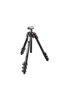
The vertical column of the Manfrotto 055 Carbon Fibre 4 section tripod allows me to quickly extend the horizontal or vertical orientation, giving me much more freedom to shoot from innovative perspectives and showcase the best angle.
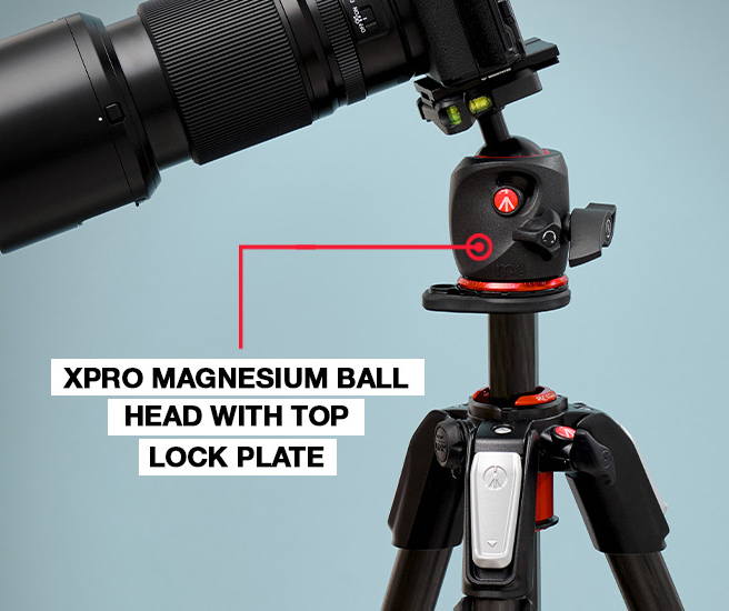
I specifically used the XPRO Magnesium Ball Head with Top Lock plate because it allows me to frame precisely thanks to the levelling bubbles and also provides great flexibility thanks to its Arca-Swiss compatible quick release.
When it comes to lighting I decided to light from the left. I believe this is naturally comfortable on the eye, as viewers read left to right. This way the shadows are in keeping with the composition. For a more editorial shot like this one, we want the products to face the copy. I ended up getting paint everywhere. Predictable outcome perhaps but totally worth it. I’m still cleaning up after the mess I made but it’s a good sign that fruitful experimentation was underway.
The flash was on high-speed, the camera locked on a focal position and then I started predicting how the objects would fall. By using the large sensor on my camera and shooting at a great depth of field, we maintained detail across the image and I was able to crop into the image but not miss any of the details happening outside the central framework.
FINAL RESULT
The final step was to combine sets, paint and products. You can’t often achieve things like this by shooting the real products themselves. This can be due to not wanting to damage a unique, one-off piece for example. Choosing plain coloured paint allowed me to then grade and tweak the colour in post. This is where the image took on the conceptual form I’d been looking for. All the composites must feel in keeping, and often, when working with lots of elements in one image, it’s vital to remember the perspective and angle of your shot. Bringing us back to the essential nature of having steady, reliable equipment in your toolkit.
Discover the behind the scene of David Lineton special projects
David Lineton’s gear
 475B
475B
Aluminium Pro Geared Tripod with Geared Column - Black
| Weight | 4.3 kg |
| Leg Sections | 3 |
| Maximum Height | 188 cm |
| Min Height | 43 cm |
| Closed Length | 80 cm |
| Maximum Height (with Center Column Down) | 162 cm |
| Bubble Spirit Level (No.) | 1 |
| Carrying Bag Included | none |
| Center Column | geared |
| Upper Disc Diameter | 60 mm |
| Top Attachment | 3/8″ screw |
| Colour | Black |
| Easy Link | No |
| Leg Type | Single |
| Leg Lock Type | Flip Lock |
| Legs Tube Diameter | 35.4, 29.5, 25 mm |
| Material | Aluminium |
| Maximum Working Temperature | 60 °C |
| Minimum Working Temperature | -30 °C |
| Safety Payload UNI/PdR 105:2021 | 20 kg |
 410
410
410 Junior Geared Tripod Head, easy to use ergonomic knobs
| Weight | 1.22 kg |
| Base Diameter | 60 mm |
| Material | Aluminium |
| Front Tilt | -30° / +90° |
| Safety Payload Weight | 5 kg |
| Bubble Spirit Level (No.) | 1 |
| Plate Type | 410PL |
| Colour | Black |
| Ball Locking | No |
| Top Attachment | 1/4″ screw, 3/8″ screw |
| Degrees of Rotation for Each Full Turn of Handle | 7.2 ° |
| Easy Link | No |
| Friction Control | No |
| Head Type | Geared Head |
| Independent Pan Lock | yes |
| Independent Tilt Lock | yes |
| Lateral Tilt | -90° / +30° |
| Maximum Working Temperature | 60 °C |
| Minimum Working Temperature | -30 °C |
| Pan Bar Included | No |
| Pan Drag | NONE |
| Panoramic Rotation | 360 ° |
| Quick Release | Yes |
| Tilt Drag | NONE |
| Working Height | 13 cm |
 MT055CXPRO4
055 carbon fibre 4-section photo tripod
| Weight | 2.25 kg |
| Leg Sections | 4 |
| Maximum Height | 170 cm |
| Min Height | 9 cm |
| Closed Length | 54 cm |
| Maximum Height (with Center Column Down) | 140 cm |
| Bubble Spirit Level (No.) | 1 |
| Carrying Bag Included | none |
| Center Column | rapid |
| Upper Disc Diameter | 60 mm |
| Top Attachment | 3/8″ screw |
| Colour | Black |
| Easy Link | Yes |
| Leg Type | Single |
| Leg Angles | 25°,46°,66°,88° |
| Leg Lock Type | Flip Lock |
| Legs Tube Diameter | 29.2, 24.8, 20.4, 16 mm |
| Material | Carbon Fiber |
| Maximum Working Temperature | 60 °C |
| Minimum Working Temperature | -30 °C |
| Safety Payload UNI/PdR 105:2021 | 20 kg |
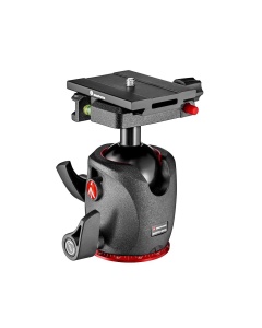 MHXPRO-BHQ6
XPRO Magnesium Ball Head with Top Lock plate
| Weight | 0.52 kg |
| Base Diameter | 60 mm |
| Material | Aluminium, Magnesium |
| Front Tilt | -90° / +40° |
| Safety Payload UNI/PdR 105:2021 | 15 kg |
| Bubble Spirit Level (No.) | 2 |
| Plate Type | MSQ6PL |
| Colour | Black |
| Base Type | 45 mm |
| Ball Locking | Yes |
| Top Attachment | 1/4″ screw, 3/8″ thread female |
| Easy Link | No |
| Friction Control | Yes |
| Head Type | Ball Head |
| Independent Pan Lock | yes |
| Independent Tilt Lock | yes |
| Lateral Tilt | -90° / +40° |
| Maximum Working Temperature | 60 °C |
| Minimum Working Temperature | -30 °C |
| Pan Bar Included | No |
| Pan Drag | NONE |
| Panoramic Rotation | 360 ° |
| Quick Release | Yes |
| Tilt Drag | NONE |
| Working Height | 11.5 cm |
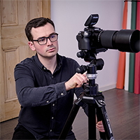
David Lineton | author
London-based photographer David Lineton's bold and graphic still life is a celebration of engaging and creative ideas as well as technical nuance and skill. Engaging experience and attention to detail, David brings a unique and premium quality to every brief.
Working across a range of both large and small format still life specialisms, including bottles, furniture, jewellery, and cosmetics, David brings his skill and precision to both still and motion